

28. Free Download Modern Conference Center and Theater CAD Drawings
Advertisements
28. Free Download Modern Conference Center and Theater CAD Drawings
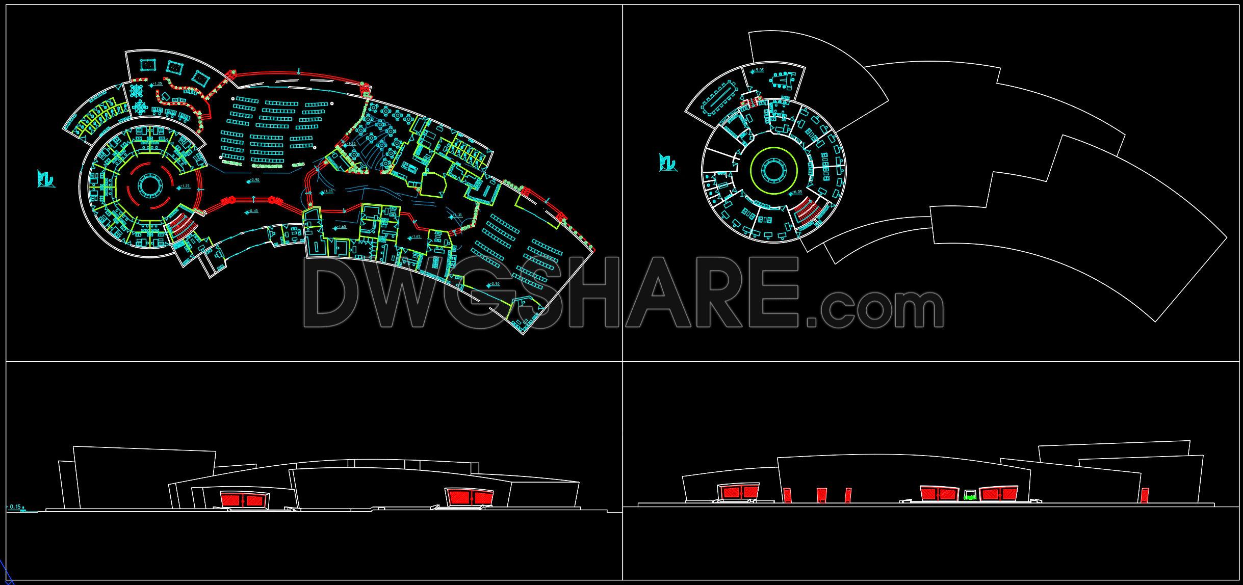
At first glance, this drawing set clearly doesn’t follow the typical “boxy” building approach. The layout is organized in a curved form, almost wrapping around a circular core—suggesting a public space where movement flows naturally and needs to be guided rather than forced.
The central core is likely the main auditorium or a small theater, with seating arranged in a radial or semi-circular pattern. While this isn’t a new idea, the way it’s handled here feels quite fluid, not rigid. The surrounding functional spaces—meeting rooms, support areas, corridors—are shaped to follow the overall geometry, creating continuity instead of fragmentation.
One thing that stands out is the internal circulation. Instead of straight corridors, the movement paths are gently curved, occasionally widening into buffer zones. If executed well, this can make the building feel less compressed, especially for high-traffic public spaces like conference centers. That said, it does require careful wayfinding design—otherwise users might feel disoriented.
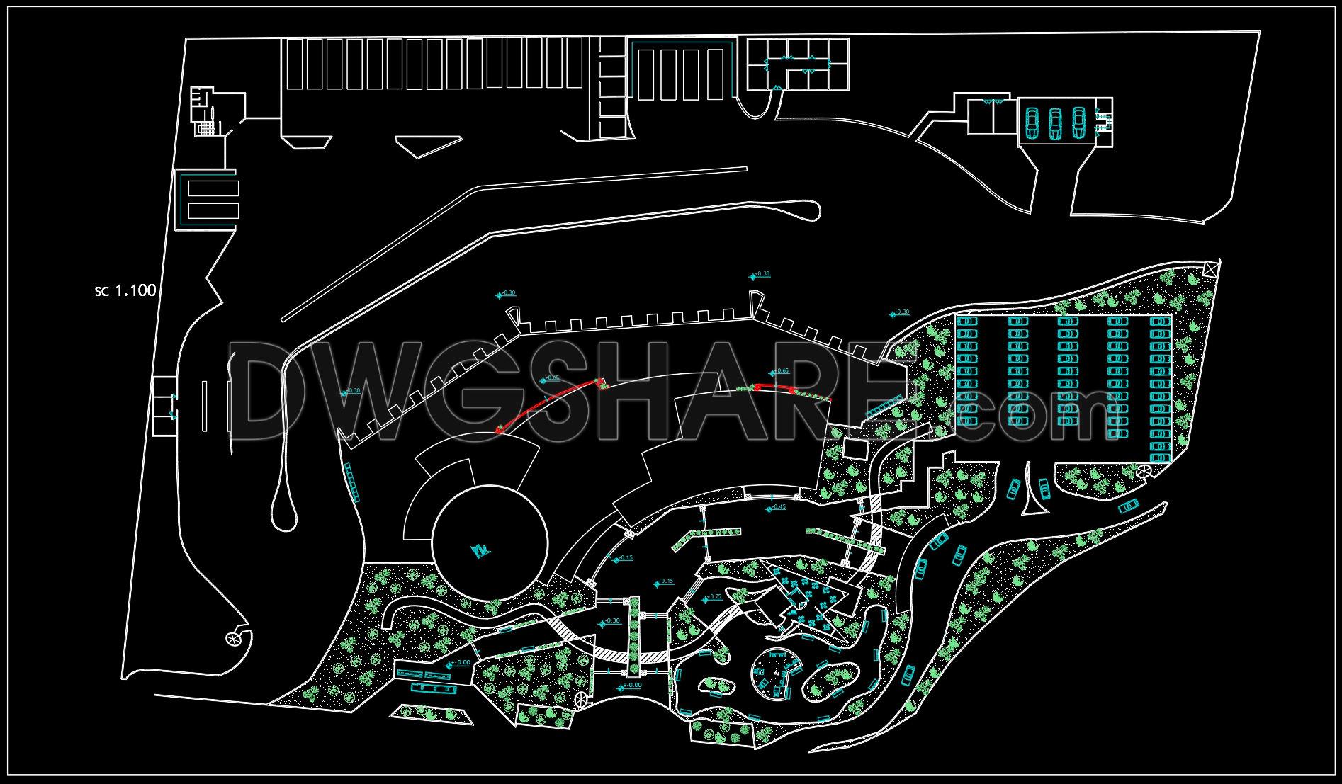
On the outside, vehicular access and parking are arranged fairly clearly. The parking area sits off to one side, connected to the main building but separated by landscaped zones. It’s a small but important move, helping reduce the harshness of hard surfaces and giving the site some breathing room.
The landscape design itself isn’t overly elaborate, but it does enough to frame the building. Green areas follow the curvature of the architecture, paired with pedestrian paths that create a soft transition between indoor and outdoor spaces. If developed properly, these areas could become active social spaces rather than just decorative buffers.
In terms of elevation, the building uses a layered composition, with curved volumes overlapping each other. It’s not overly expressive, but it creates a recognizable identity. Openings, glazing, and subtle color accents (as indicated in the drawings) suggest an intention to lighten the mass and avoid the heaviness often seen in large public buildings.
Of course, a geometry like this—curved and non-symmetrical—comes with its own construction challenges. From structure to finishing, everything needs tighter control, especially at transitions between curves and straight lines. But in return, the project gains a distinct character that doesn’t easily blend into the background.
Overall, this is a solid reference if you’re looking for a softer architectural approach for mid-scale conference or theater buildings. It doesn’t try too hard to impress visually, but instead focuses on spatial experience and how people move through the building—something many projects tend to overlook.
I also recommend downloading other Cinema and Theater CAD drawings for your project reference.
- File format: .DWG
- Size: 1 MB
- Source: DWGshare
- AutoCAD platform 2018 and later versions. For downloading files there is no need to go through the registration process
Advertisements